A monogram is the centrepiece graphic of an event — the names, the date, the flourish that ends up on the welcome sign, the dance floor projection and every photo booth print of the night. Designing one used to mean a designer, a brief and a few days of back and forth.
This guide walks through making one yourself in a couple of minutes, with no design software involved. There are two routes through the tool and they solve genuinely different problems, so it is worth knowing which one you want before you start.
Before you start
- A name and an occasionThe text that goes big — "Ashley's Sweet Sixteen", "Laura & James", a surname. That is the only field the tool truly requires.
- A rough idea of coloursPlain English works: "Gold", "Rose Gold", "Dusty blue and cream". You are describing, not picking hex codes.
- An inspiration image, optionallyIf the event already has an invitation or a template you like, keep it handy — the second route builds the monogram around it.
- A free accountGenerating uses credits. New accounts start with enough to try this out, and trial results carry a watermark until you upgrade.
Two ways to make it
The first screen asks you to pick a route. This is not a cosmetic choice — the two paths ask you for completely different things.
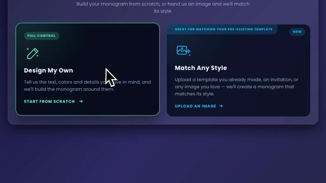
Design My Own
You describe the monogram: text, colours, flowers, style. Best when the event has no artwork yet and you are starting from a blank page.
Match Any Style
You hand over an image — an invitation, a template, anything you love — and the monogram is built to match its style, colours and mood. Best when the look is already decided.
You can switch between them at any point with the "Change option" link at the top of the form. Nothing you have typed is lost until you generate.
Route one: design your own from scratch
Three short sections, top to bottom. Only two fields in the whole form are mandatory, which is deliberate — the more you leave blank, the more freedom the model has.
Fill in The Essentials
Two required fields here. Prominent Text is the wording that dominates the design — in the walkthrough it is "Ashley's Sweet Sixteen". Main Colour takes plain language: "Gold", not a colour picker.
Secondary Colour is optional and worth using. A single colour tends to produce flatter results; a pairing like Gold and Purple gives the design somewhere to go.
Include a Princess Crown? is a straight yes or no, and it exists because quinceañera monograms ask for one constantly.
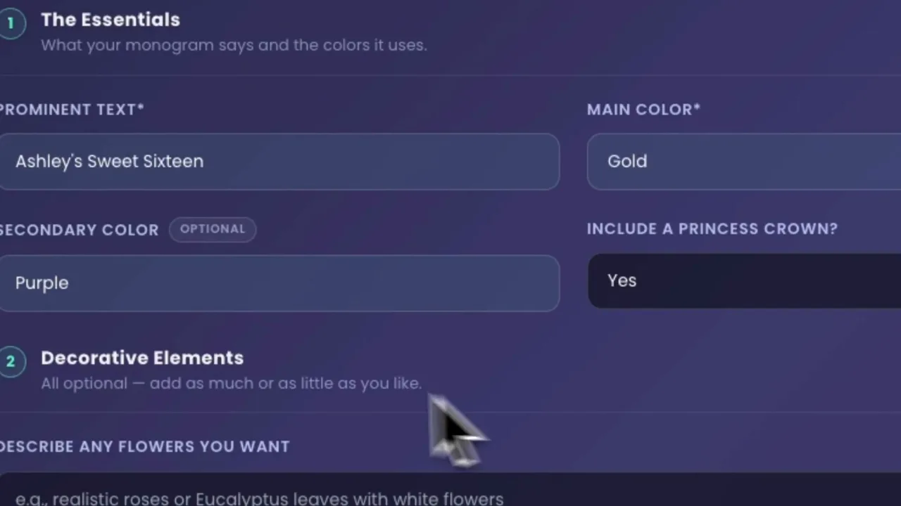
Add Decorative Elements
Everything in this section is optional. The heading says so, and it is not being polite — a monogram with two well-chosen details usually beats one carrying five.
Describe any flowers you want and Describe any other element are free text. Be specific about what you want rather than what you do not: "realistic purple roses" and "small butterflies with gold accents" both work well.
Design Style sets the register of the whole piece. "Majestic quinceañera", "elegant wedding", "graduation" — one or two words is plenty.
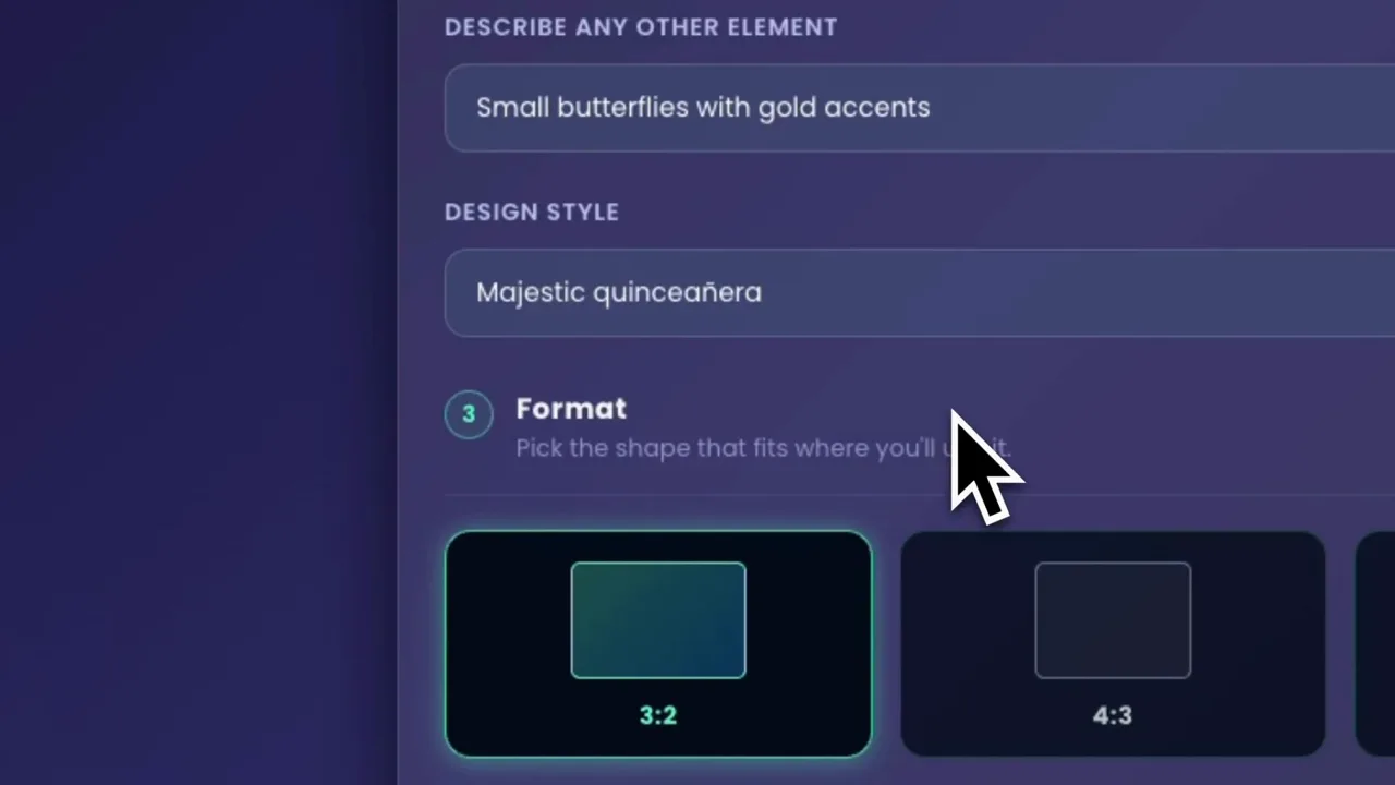
Pick a Format and generate
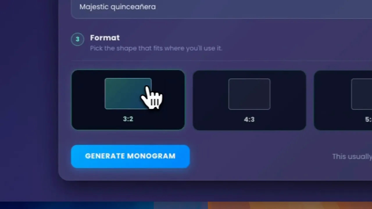
Four aspect ratios: 3:2, 4:3, 5:4 and 1:1. Pick by where the monogram will end up, not by which thumbnail looks best.
3:2 is the default and suits projections and wide signage. 1:1 is the one you want for Instagram or a square print. Getting this right now saves cropping something you cannot re-crop later.
Then press Generate Monogram. It usually takes one to two minutes — leave the window open while it works.
Review the result
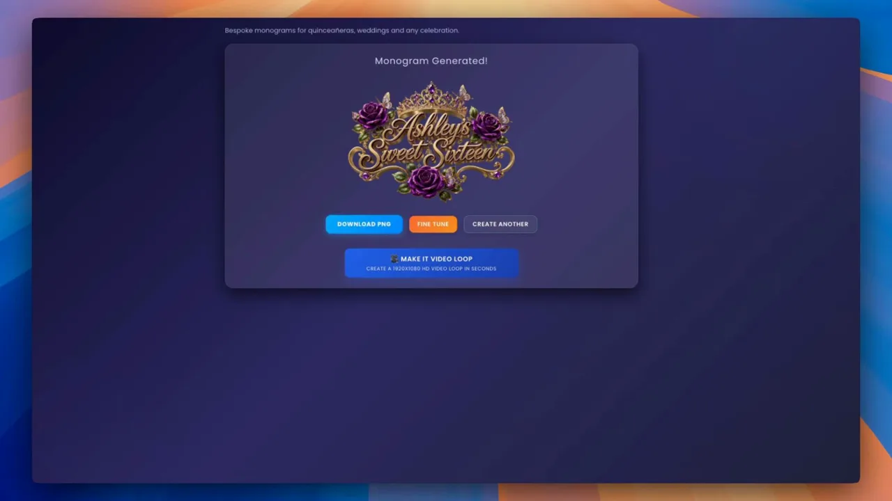
When it lands you get four options: Download PNG for the file itself, Fine Tune to adjust the result, Create Another to run it again, and Make it Video Loop to animate it.
The PNG comes out with a transparent background, so it drops straight onto a photo booth template or a coloured backdrop without any cutting out.
Route two: match a style you already have
This is the route to take when the event already has a look. Instead of describing a style in words, you show it one — and the monogram comes back speaking the same visual language as the invitation it will sit beside.
Upload your inspiration
Drag an image onto the dropzone or click to browse. JPG, PNG and WEBP are accepted.
The image is doing real work here: its colours, typography and mood all feed the result. A crisp invitation gives a much better read than a dim photo of one.
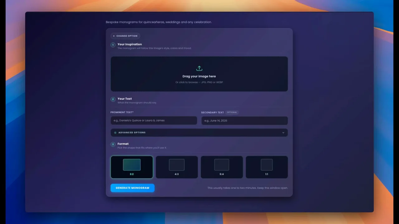
Tell it what the monogram should say
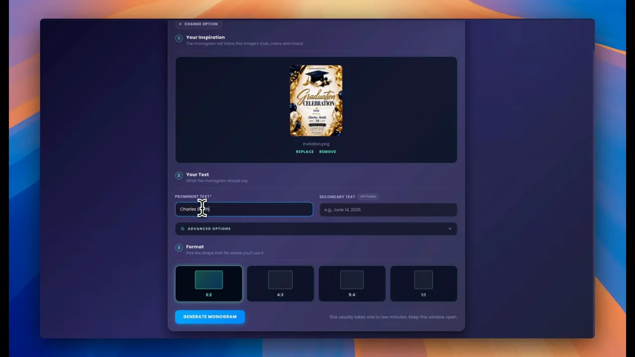
The form collapses to almost nothing, because the image is carrying the styling. Prominent Text is required — "Charles Smith" in the walkthrough — and Secondary Text is optional, typically a date.
No colour fields, no style field. Asking for them would only fight the image you just uploaded.
Use Special instructions when you need a specific detail
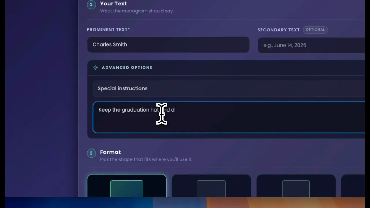
Open Advanced options and you get a free text box for anything the image cannot tell the tool on its own.
This is where you keep a specific element from the source — "keep the graduation hat and the diploma" — or steer it away from copying something wholesale. Describe what you want to see; instructions phrased as what you do not want tend to backfire.
Getting better results
Describe what you want, never what you do not
The single most useful habit. "Clean background" gets you a clean background; "no clutter in the background" often gets you clutter, because the description still puts the idea on the table.
Two details beat five
Every element you add competes for the same space. Roses and butterflies read beautifully together. Roses, butterflies, ribbons, stars and a crown read as noise.
Name colours the way a florist would
"Dusty rose", "champagne gold", "deep navy" carry far more information than "pink", "gold", "blue" — and they are the words your client is already using.
Keep the good ones as you go
Each run produces something genuinely new rather than a variation on the last. If a result is close, download it before generating again.
Match the ratio to the destination
Decide where the monogram is going before you pick the format. A 3:2 monogram forced into a square Instagram post loses its edges, and no amount of re-cropping puts them back.
Common mistakes
Writing a paragraph into Prominent Text
It caps at 50 characters, and long strings are where text rendering starts to go wrong. Names and occasions, not sentences.
Generating twice because the first run felt slow
One to two minutes is normal. Starting a second run does not speed anything up and spends another credit.
Uploading a screenshot instead of the artwork
On the Match Any Style route, a low-resolution screenshot of an invitation gives the tool a muddy read on the colours. Use the original file where you can.
Treating the style field as a brief
"Majestic quinceañera" works. "Elegant but modern with a vintage feel and a touch of rustic" pulls in five directions and lands in none of them.
Turn it into a video loop
Once a monogram exists, Make it Video Loop turns it into an animated HD loop without starting over — the still you just generated becomes the source, so the artwork stays identical.
That is the format you want for a projector, an LED wall or a screen behind the dance floor, where a static image looks flat all night.
Open the video monogram makerFrequently asked questions
Do I need any design experience to make a monogram?
No. Both routes are forms — you describe the event in plain language, or upload an image you like. There is no canvas, no layers and no design software involved at any point.
How long does it take to generate a monogram?
Usually one to two minutes. Leave the window open while it runs; starting a second generation does not make the first one finish sooner.
Can I make a monogram from an invitation I already have?
Yes, that is what the Match Any Style route is for. You upload the invitation, template or any image with the look you want, add the text, and the monogram is built to match its style and colours.
What file do I get at the end?
A PNG with a transparent background, which drops straight onto a photo booth template or a coloured backdrop with no cutting out. You can also turn the result into an HD video loop.
Which aspect ratio should I choose?
Pick it by where the monogram will be used. 3:2 suits projections and wide signage, 1:1 is right for square prints and Instagram. Choosing before you generate saves you cropping the design afterwards.
Is it free to try?
New accounts include enough credits to make a monogram and see the result. Trial downloads carry a watermark, which comes off once you are on a paid plan.
Make your first one
Pick the route that matches your situation — a blank page or an invitation you already love — and give it two minutes. The first result tells you far more about what to ask for than any amount of planning.